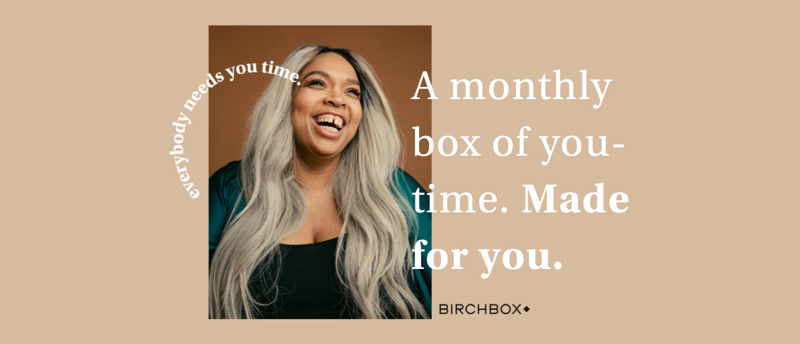
Birchbox
Helping new members understand their benefits, discover their best products, and feel confident.
Launch

Overview
Birchbox is a monthly beauty subscription box, known for curating high-quality, personalized samples across skin care, hair, and makeup. In 2020, the company introduced a new pricing model — offering members more choice and customization. But the onboarding experience wasn’t keeping up.
My first project was to reimagine the new member onboarding experience. We wanted to ensure users understood their benefits, started personalizing their boxes, and saw the value right away — setting them up to stick around longer.
Role
Sr Product Designer
→ Research
→ Stakeholder alignment
→ Wireframes to prototypes
→ Visual design
→ Billing page experiments
Team
Director of Product
Product Manager
6 Engineers
User Insights Lead
Director of Operations
Client Success Lead
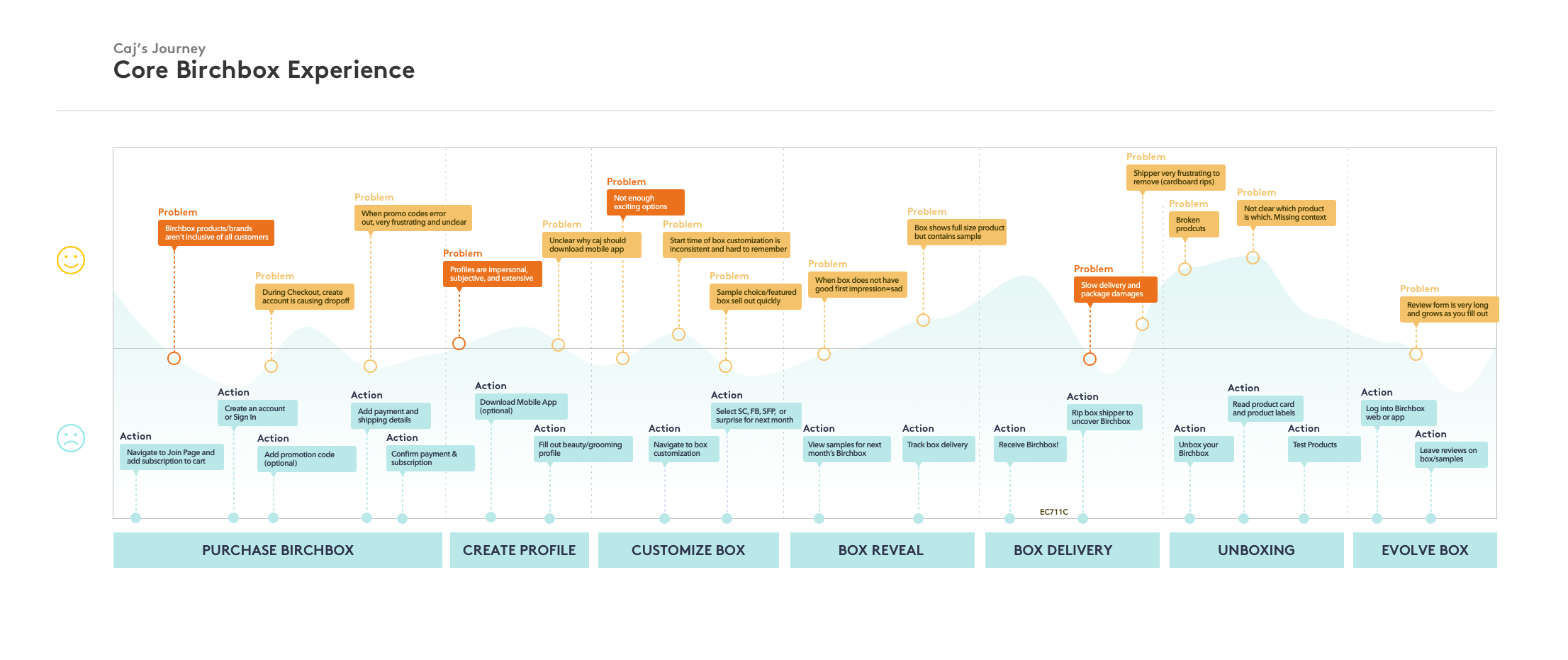
The Problem
New members were churning after their first box.
Despite major investments in paid acquisition, the team was seeing dropoff in onboarding, low product pick rates, and high early churn — especially among new price tiers.
From 20+ user interviews and working with our User Insights Lead, we saw:
- Users weren’t clear what they were getting
- Product matching felt impersonal
- People didn’t feel "in control" of their subscription
Opportunity
How might we
help
new
members
feel
more
confident
,
in control
,
and
excited
to stay
?
Solutions
Highlights
- Value-forward welcome flow
- How the tiered pricing worked
- What they’d be getting this month
- A progress bar toward box customization
- How to swap or upgrade their subscription
We tested this across tiers and saw stronger activation among newer price-sensitive segments.
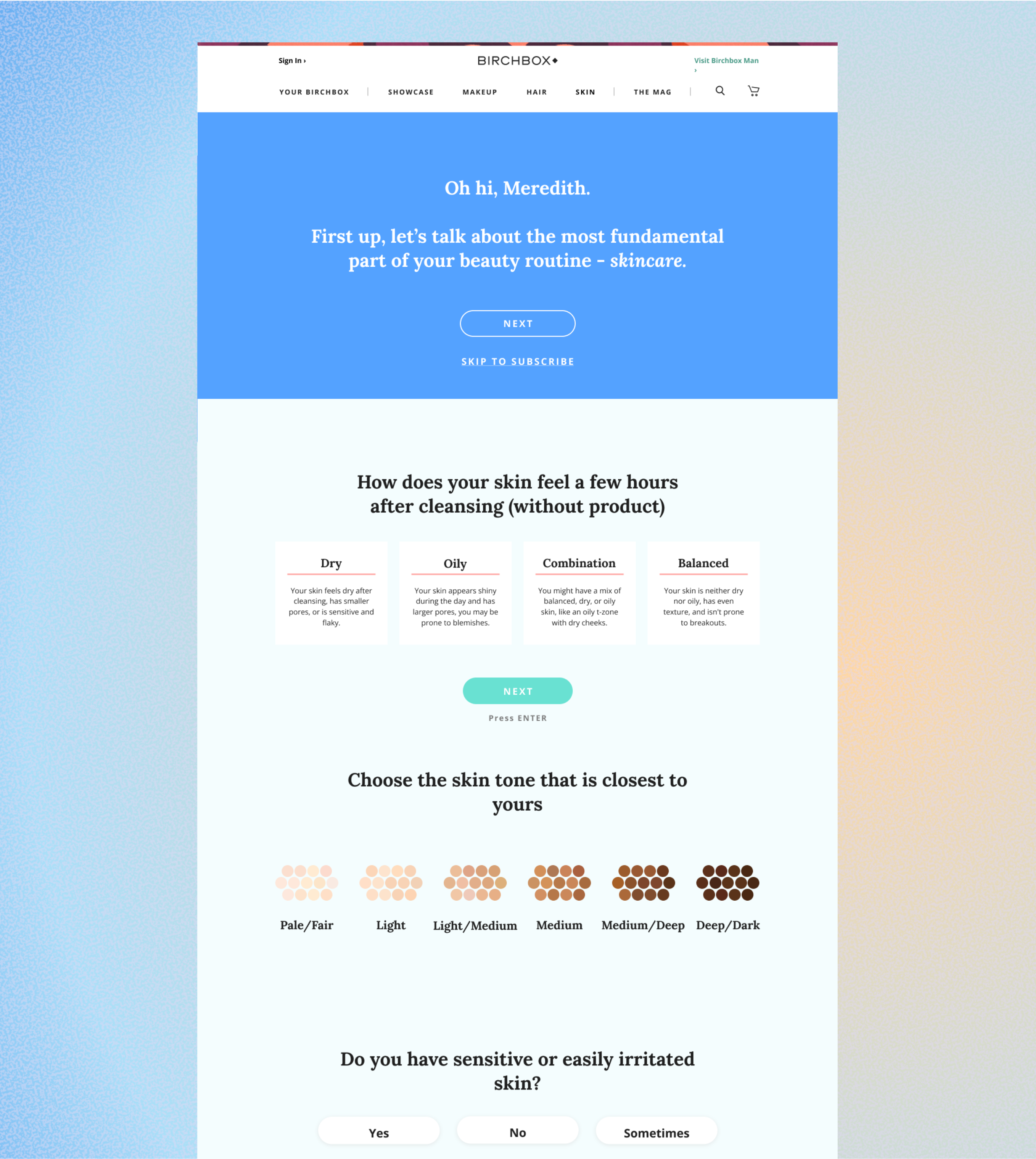
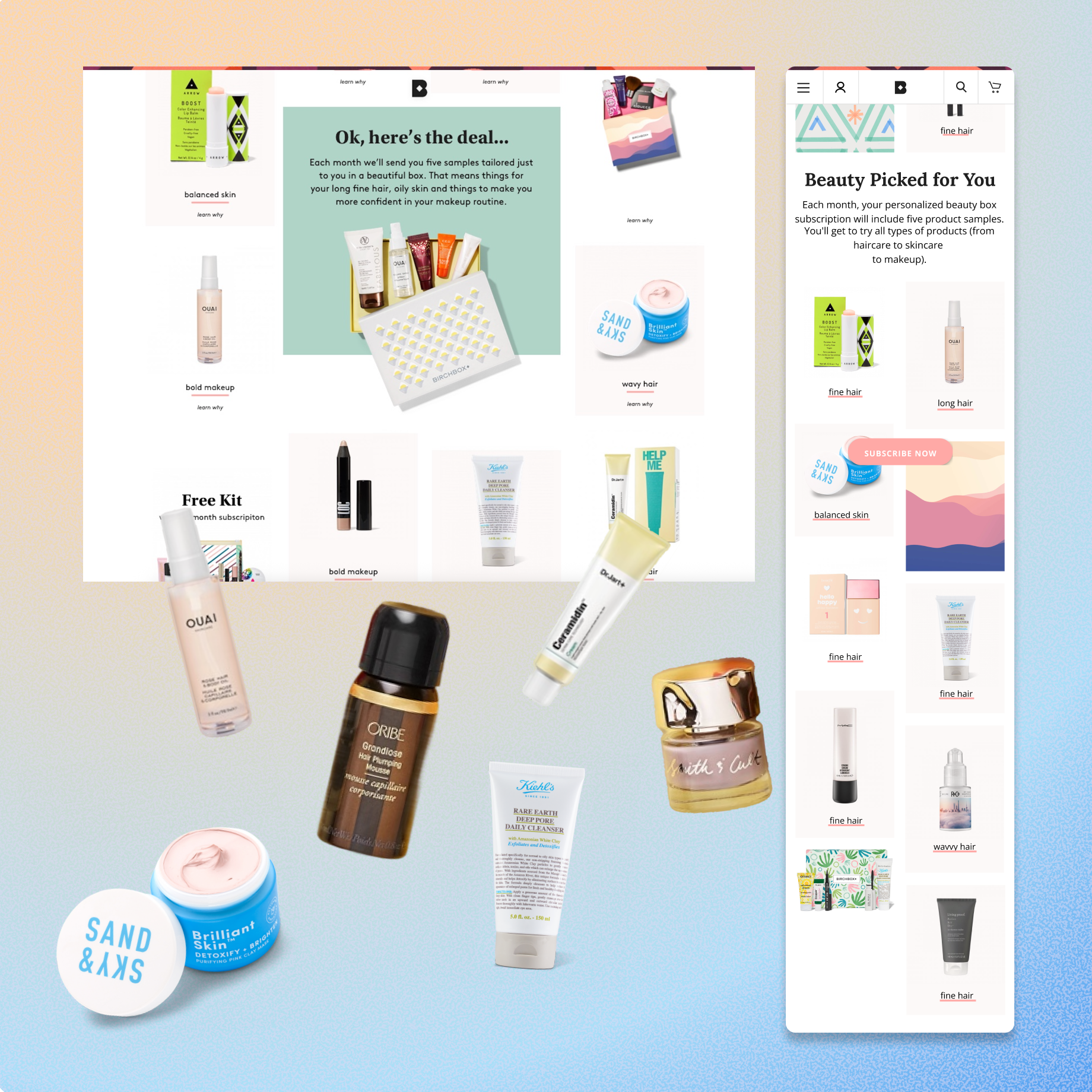
- Personalized product picking
Product pick was a major indicator of retention, but many users missed the window or skipped it. We:
- Integrated product picking into the onboarding flow
- Added nudges + countdowns
- Tailored product language based on quiz data
- Clearer confirmation & next steps
After sign-up, we clarified what to expect next:
- When boxes would ship
- How to customize next month’s box
- How to manage your subscription
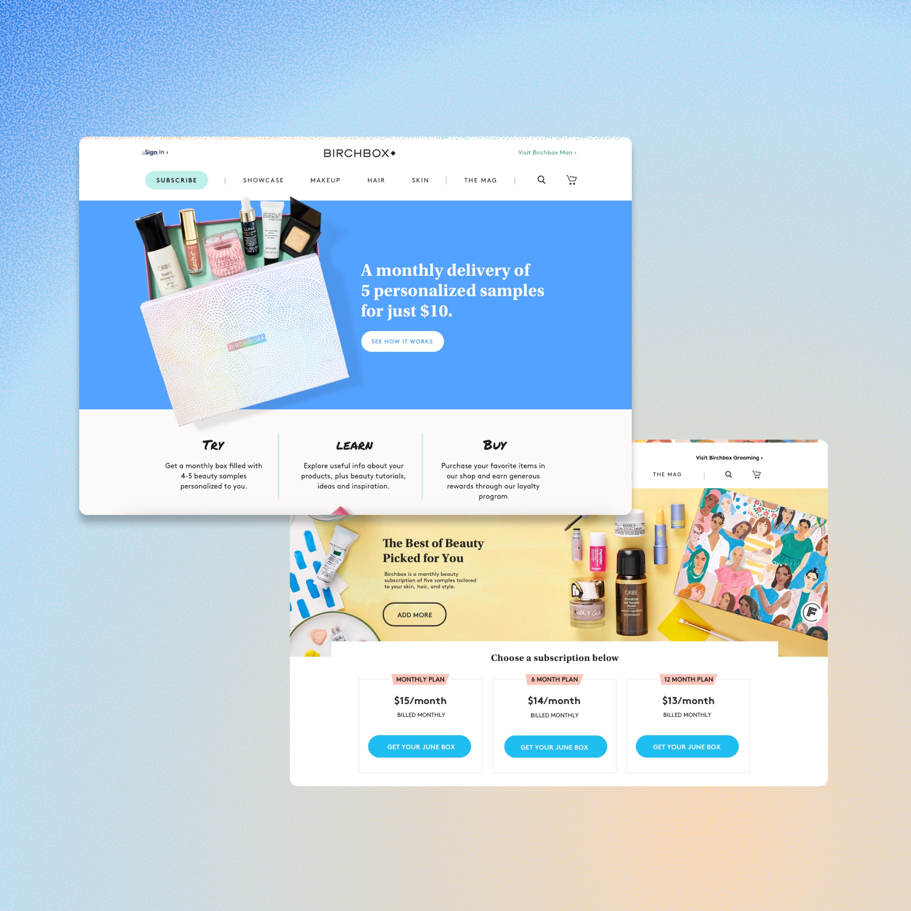
Join Flow: BEFORE Price Increase (@ $10 base price)
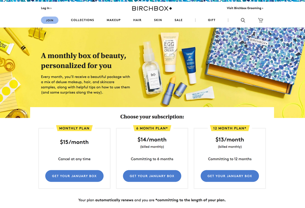
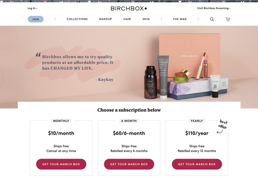
V3 AFTER Price Increase, with monthly payment
Original Version containing no substantial account information
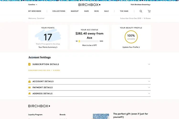
V3 Indicating Subscription vertical, length, boxes are remaining, and opt-out toggle
Outcome
Improved retention through clearer, more personalized onboarding, pricing, and billing
↑ 13%
product pick rate

↑ 9%
Retention at month 2
+ Higher NPS among new pricing tiers
+ Reduced support tickets around re-subscription
Reflection
This project was an exercise in lifecycle-driven product design. We needed to align product and growth goals, work within brand constraints, and think holistically about activation — from sign-up to second month and beyond.
One of the biggest challenges was designing within a 10 year old legacy onboarding system tightly coupled to physical operations. This complexity forced us to scale back our ambitions until deeper tech debt was addressed a full year later — a reminder that product impact often depends as much on timing and infrastructure as it does on vision.

Other Projects


CONTACT
caroline.lukins@gmail.com
SOCIAL
Site developed by Caroline Lukins 2025

Birchbox
Helping new members understand their benefits, discover their best products, and feel confident.
Launch
Overview
Birchbox is a monthly beauty subscription box, known for curating high-quality, personalized samples across skin care, hair, and makeup. In 2020, the company introduced a new pricing model — offering members more choice and customization. But the onboarding experience wasn’t keeping up.
My first project was to reimagine the new member onboarding experience. We wanted to ensure users understood their benefits, started personalizing their boxes, and saw the value right away — setting them up to stick around longer.
Role
Sr Product Designer
→ Research
→ Stakeholder alignment
→ Wireframes to prototypes
→ Visual design
→ Billing page experiments
Team
Director of Product
Product Manager
6 Engineers
User Insights Lead
Director of Operations
Client Success Lead
The Problem
New members were churning after their first box.
Despite major investments in paid acquisition, the team was seeing dropoff in onboarding, low product pick rates, and high early churn — especially among new price tiers.
From 20+ user interviews and working with our User Insights Lead, we saw:
- Users weren’t clear what they were getting
- Product matching felt impersonal
- People didn’t feel "in control" of their subscription
Opportunity
How might we
help
new
members
feel
more
confident
,
in control
,
and
excited
to stay
?
Solutions
Highlights
Value-forward welcome flow
The new welcome flow emphasized value — not just products — by clearly showing:
- How the tiered pricing worked
- What they’d be getting this month
- A progress bar toward box customization
- How to swap or upgrade their subscription
We tested this across tiers and saw stronger activation among newer price-sensitive segments.
- Personalized product picking
Product pick was a major indicator of retention, but many users missed the window or skipped it. We:
- Integrated product picking into the onboarding flow
- Added nudges + countdowns
- Tailored product language based on quiz data
- Clearer confirmation & next steps
After sign-up, we clarified what to expect next:
- When boxes would ship
- How to customize next month’s box
- How to manage your subscription
Join Flow: BEFORE Price Increase (@ $10 base price)
V3 AFTER Price Increase, with monthly payment
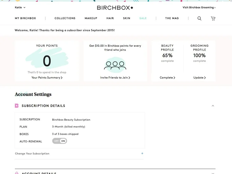
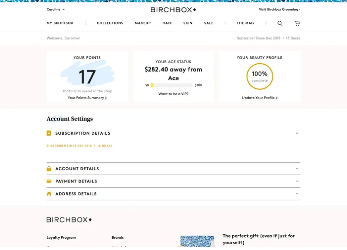
Original Version containing no substantial account information
V3 Indicating Subscription vertical, length, boxes are remaining, and opt-out toggle
Outcome
Improved retention through clearer, more personalized onboarding, pricing, and billing
↑ 13%
product pick rate

↑ 9%
Retention at month 2
+ Higher NPS among new pricing tiers
+ Reduced support tickets around re-subscription
Reflection
This project was an exercise in lifecycle-driven product design. We needed to align product and growth goals, work within brand constraints, and think holistically about activation — from sign-up to second month and beyond.
One of the biggest challenges was designing within a 10 year old legacy onboarding system tightly coupled to physical operations. This complexity forced us to scale back our ambitions until deeper tech debt was addressed a full year later — a reminder that product impact often depends as much on timing and infrastructure as it does on vision.

Other Projects


CONTACT
caroline.lukins@gmail.com
SOCIAL
Site developed by Caroline Lukins 2025


Birchbox
Helping new members understand their benefits, discover their best products, and feel confident.
Launch
Overview
Birchbox is a monthly beauty subscription box, known for curating high-quality, personalized samples across skin care, hair, and makeup. In 2020, the company introduced a new pricing model — offering members more choice and customization. But the onboarding experience wasn’t keeping up.
My first project was to reimagine the new member onboarding experience. We wanted to ensure users understood their benefits, started personalizing their boxes, and saw the value right away — setting them up to stick around longer.
Role
Sr Product Designer
→ Research
→ Stakeholder alignment
→ Wireframes to prototypes
→ Visual design
→ Billing page experiments
Team
Director of Product
Product Manager
6 Engineers
User Insights Lead
Director of Operations
Client Success Lead
The Problem
New members were churning after their first box.
Despite major investments in paid acquisition, the team was seeing dropoff in onboarding, low product pick rates, and high early churn — especially among new price tiers.
From 20+ user interviews and working with our User Insights Lead, we saw:
- Users weren’t clear what they were getting
- Product matching felt impersonal
- People didn’t feel "in control" of their subscription
Opportunity
How might we
help
new
members
feel
more
confident
,
in control
,
and
excited
to stay
?
We knew that new members needed to feel 3 things:
→ “I understand what I’m getting” = ↑ Conversion
→ “This feels personalized to me” = ↓ Churn
→ “This is a good deal” = ↑ Perceived value
Solutions
Highlights
- Value-forward welcome flow
- How the tiered pricing worked
- What they’d be getting this month
- A progress bar toward box customization
- How to swap or upgrade their subscription
We tested this across tiers and saw stronger activation among newer price-sensitive segments.
- Personalized product picking
Product pick was a major indicator of retention, but many users missed the window or skipped it. We:
- Integrated product picking into the onboarding flow
- Added nudges + countdowns
- Tailored product language based on quiz data
- Clearer confirmation & next steps
After sign-up, we clarified what to expect next:
- When boxes would ship
- How to customize next month’s box
- How to manage your subscription
Join Flow: BEFORE Price Increase (@ $10 base price)
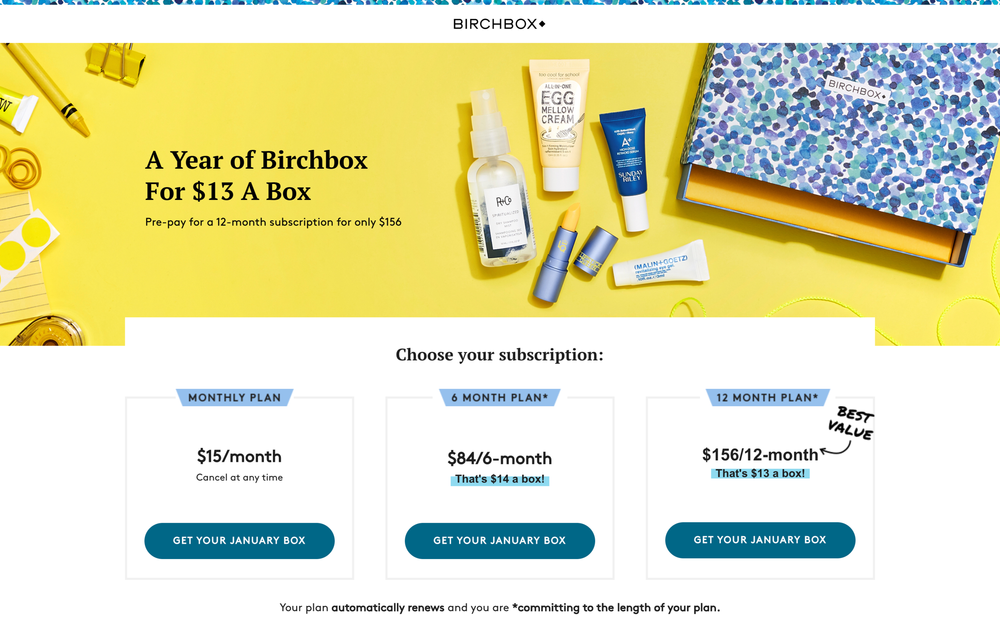
V2 AFTER Price Increase, with upfront payment
V3 AFTER Price Increase, with monthly payment
Original Version containing no substantial account information
V3 Indicating Subscription vertical, length, boxes are remaining, and opt-out toggle
Outcome
Improved retention through clearer, more personalized onboarding, pricing, and billing
↑ 13%
product pick rate

↑ 9%
Retention at month 2
+ Higher NPS among new pricing tiers
+ Reduced support tickets around re-subscription
Reflection
This project was an exercise in lifecycle-driven product design. We needed to align product and growth goals, work within brand constraints, and think holistically about activation — from sign-up to second month and beyond.
One of the biggest challenges was designing within a 10 year old legacy onboarding system tightly coupled to physical operations. This complexity forced us to scale back our ambitions until deeper tech debt was addressed a full year later — a reminder that product impact often depends as much on timing and infrastructure as it does on vision.

Other Projects


CONTACT
caroline.lukins@gmail.com
SOCIAL
Site developed by Caroline Lukins 2025
